
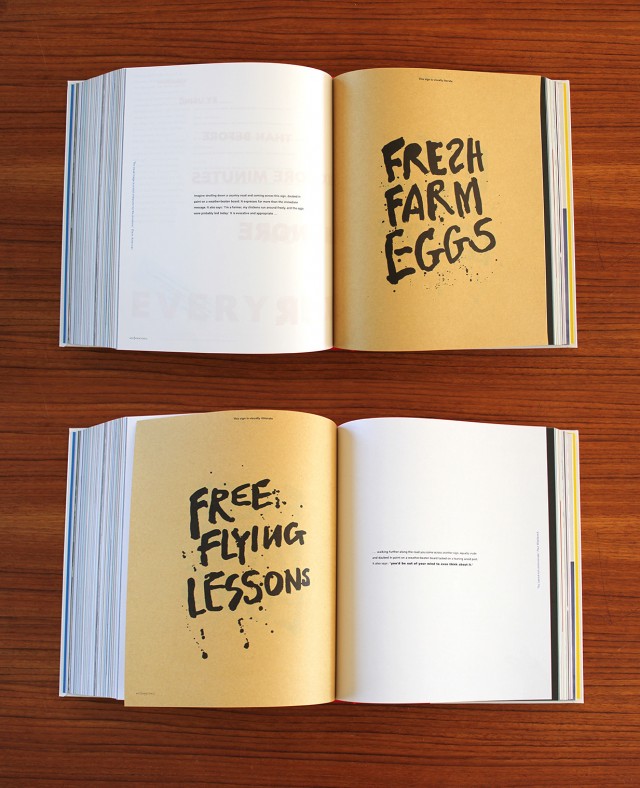
Har du tänkt på hur mycket bara typsnittet kommunicerar? I Alan Fletchers (fantastiska) bok The Art of Looking Sideways så ger han ett bra exempel:
“Imagine strolling down a country road and coming across this sign, daubed in paint on a weather-beaten board. It expresses far more that the immediate message. It also says: ‘I’m a farmer, my chickens run around freely, and the eggs were probably laid today.’ It is evocative and appropriate …”
“… walking further along the road you come across another sign, equally crude and daubed in paint on a weather-beaten board tacked on a leaning wood post. It also says: ‘you’d be out of your mind to even think about it.’”
Vilka typsnitt väljer du till ditt företag/produkt? Värt att ge en extra tanke…
Leave a reply